
Responsibly Visualising a Pandemic of Invisible Proportions
The article was written in March 2021
In the past decade we have found ourselves living with more and more data. Networked technologies have made us live more and more through data. But in the last year or so, the global pandemic has led to us living more and more as data; and proved that data visualisation – and using it responsibly – is more critical than ever before.
Covid-19 has had an unprecedented global impact, yet this impact is literally invisible. After killing more than 2.5 million people in every corner of the world in one year, we still have no clear visual representation for how the virus has affected people’s lives. This has become an opportunity and a calling for data visualisation – to expose the invisible.
Points on a map
Back in January 2020, the initial epidemiological maps being published in the news still felt to most western eyes like yet another health report about some disease in a faraway place. But these Wuhan-centered maps were quickly zoomed out as more spots were added around the globe.
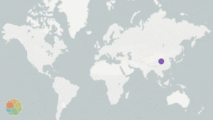
The pulsating map found at Nextstrain.org tells the tale of a virus on the march.
Pandemic nationalism
When governments began refusing visas based on infection levels, the pandemic started its national phase. This was also when media outlets started presenting, through visualisations, national ‘horse races’ signalling the pandemic’s epicenter du-jour. Travel restricted ‘world citizens’ were once more defined by their nationality and the boundaries of their public health authorities. Maps and other nationality-focused charts attempted to visualise the global state of the pandemic, and ideally inform measures and share best practices to curb local outbreaks. But with different data collection approaches, health systems and political interests, the simplified national comparison provided by many of these visualisations often served to reinforce broad generalisations – for example, about the unique cultures and national characters of Chinese people, Italians, or Americans – but it offered little insight to inform either personal protection or public policy.
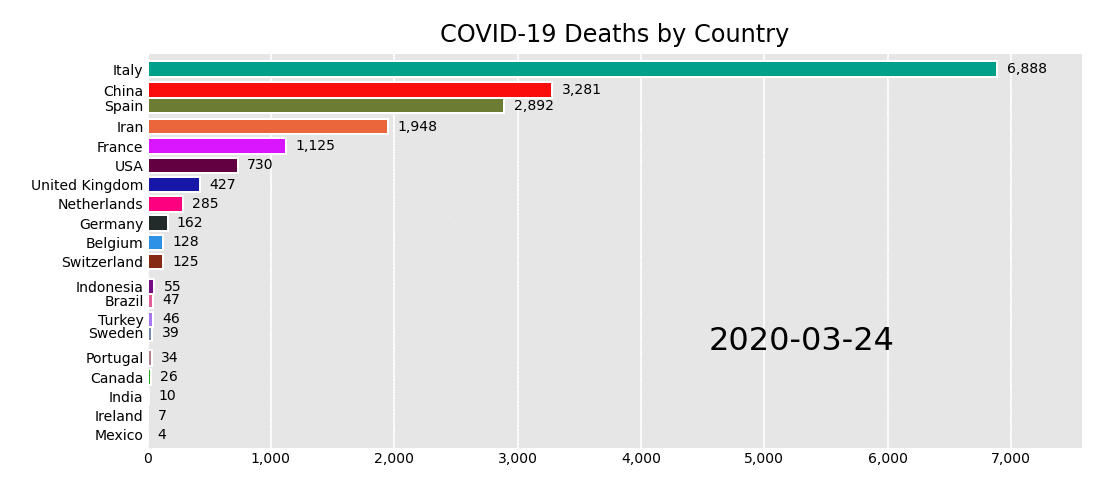
The daily national death race
Beyond the curve
‘Flattening the curve’ became an immediate icon as a public call to arms, and was possibly the single most influential chart of the pandemic. The chart presented two possible scenarios for the spread of the pandemic and showed how an unmitigated response could quickly overwhelm health systems (while both the concept and the chart are not new, this public health approach didn’t make it into the public discourse until March 2020). ‘Flattening the curve’ charts helped mobilise the public to embrace face masks and public distancing, and served as the model for data-driven discussions around more severe measures like quarantines and lockdowns.
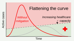
While the chart was a useful starting point, later iterations suggested we should also be working to ‘raise the line’ (representing health systems’ capacities, which had been mostly represented in a fixed, horizontal way) – but in most cases, this second call to action didn’t make it into the chart.
Additionally, the decreasing slopes of both curves generated false expectations of a single major peak that we would only need to cross once. In reality, however, many places have been through multiple additional surges, and new mutations of the virus have made later curves even higher than earlier ones.
How to track everybody, everywhere, every day?
These famous curves depict the number of confirmed cases. But this number doesn’t represent all the people who may be asymptomatic, but still infectious. To effectively prevent outbreaks, infected individuals have to be identified even before they are symptomatic enough to get tested. However, the continuous personal health and location surveillance needed to do this would potentially impede on our very basic civil liberties.
I personally helped develop a daily consensual self-reporting tool for early symptoms. We avoided collecting precise geographic data, but at a certain point the researchers and I started to doubt the accuracy of our approach. Siding with more privacy and less accuracy was not an obvious tradeoff to make when it jeopardised our ability to stop an outbreak before it hit the community.
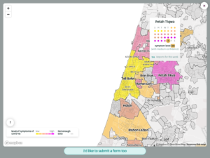
CoronaIsrael.org – map showing geographic analysis (and uncertainty) of self reported early symptoms
CoronaIsrael.org – map showing geographic analysis (and uncertainty) of self reported early symptoms
We made a point of presenting our analysis transparently back to those reporting daily, and we attempted to communicate the uncertainties involved on our maps, but in the end the nuances of uncertain aggregated data that informed the research proved far less insightful or actionable for the individuals reporting it.
Body counts
As numbers soared and government responses varied, journalists struggled to communicate the magnitude of the damage. In the US specifically, daily newspapers devoted front pages to ‘data obituaries’ that augmented the overwhelming statistics with human stories. These were noble attempts to humanise numbers, but it is still not clear whether we can grasp large numbers and empathise with individual stories simultaneously.
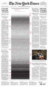
Feb 21st, 2021 Front cover of the New York Times showed a “Wall of Grief”
Feb 21st, 2021 Front cover of the New York Times showed a “Wall of Grief”

On May 24, 2020 the New York Times’ front cover and inner pages featured 1000 out of the 100,000 US deaths
On May 24, 2020 the New York Times’ front cover and inner pages featured 1000 out of the 100,000 US deaths
Dashboards for the masses
It took years for news agencies to hesitantly adopt data journalism and visualisation. In 2020, we ignored all questions of data literacy and turned every news site into a public dashboard. Positive tests, Covid deaths, hospitalisation stats and recovery numbers, followed by charts for tax collection, unemployment rates, domestic violence, suicides… Vaccinations have now become the most recent key performance indicator, with percentage charts added for both first and second shots.
It seems like almost overnight the term ‘data journalism’ essentially evaporated. With a pandemic that can only be properly grasped through numbers and charts, all journalism became data-driven. Now our heightened focus on public health should also inform a heightened sensitivity towards data visualisation and its contribution to the health of our public discourse.